Messages on Anaglyphs group
Post on Anaglyphs group
Viewed
 (183K)
> ...regarding the alignment. In what way could alignment be improved?
In my editor I duplicate its size and load it as a png in SPM.
In Easy Adjustment in 100% view I align the center of the image with a VP=14
and align the points above (top) and below this point (bottom) with a ImageSize correction of L=101.0.
Finally in the Vpers tab with a FL=50 I make a VP-rotation of L=-2.0 degrees
to make the left an right top red parts align with their respective cyan parts.
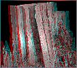
Copied back to my editor the result is a lot easier to my old eyes than the original.
(result attached).
As said, it may be my old eyes but sometimes a nice anaglyph like yours invites closer
inspection and then I notice I can't focus as it should be. After
making the correction described above yours looks perfect to me: tops!