Thanks for the attention to my anaglyph Imre.
If you want my opinion to your statement and questions this is what I
believe, language barrier not withstanding...
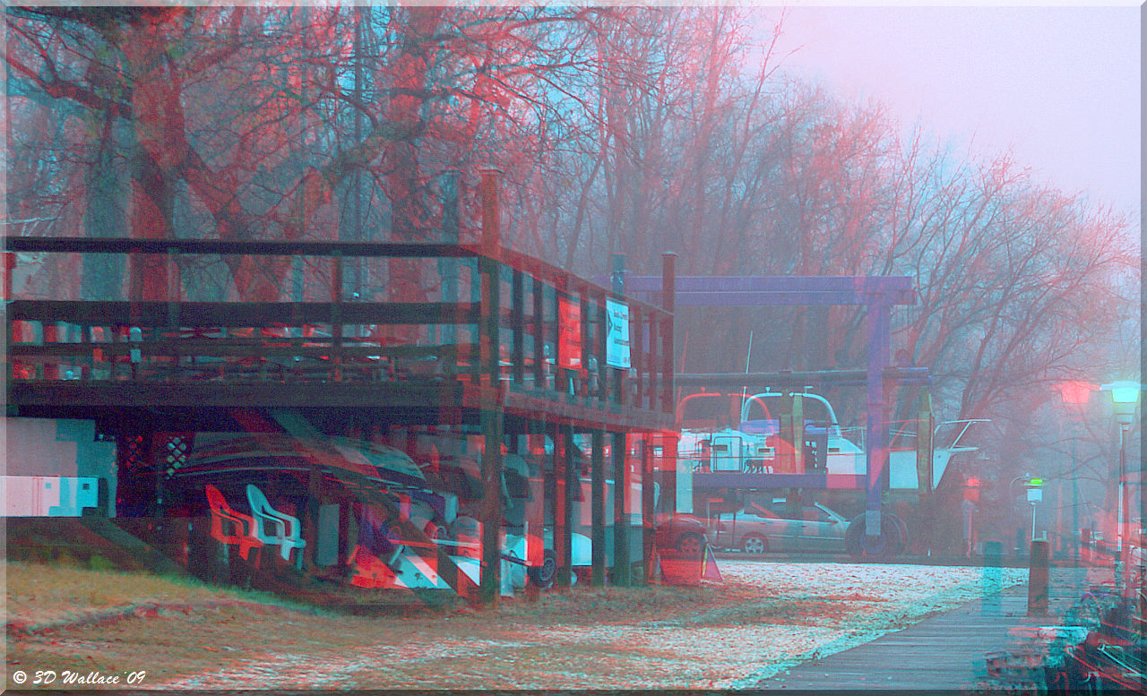
"Bad stereo image"... or maybe not the best it can be?
It can of course always be better!
"Rivalries on the edges"... I don't see the rivalries on my monitor.
Are these color or light rivalries?
"Too much deviation for the far point"... There is an excessive amount of
deviation however I do not have trouble fusing it. To decrease the
deviation as you have done by your method, you have compromised the artistic
content of the image by eliminating most of the bulkhead thus also eliminating
the feeling of being there. Remember, "Content is king".
Mathematics and rules are guides to follow but not necessarily to be
followed so strictly as to impair artistic license. You are very good at
the science while I am not, but there needs to be a compromise between the
two extremes, wouldn't you agree? Otherwise an image would seem cold and
calculated instead of warm with feeling and emotion. Ultimately, that's
what any type of photography is suppose to be about isn't it?
You are correct about the choice of stereo base (technically), but not
correct about the original artist's intent.
By the way, I already had a version of this scene with less stereo base,
less of the bottom and more of the far point. Here it is for
you.
I still have a problem compromising better focal point for a bottom window
violation. For me, one cancels out the other.
Brian
----- Original Message -----
Sent: Thursday, December 10, 2009 3:24
PM
Subject: Re: [Anaglyphs] OPHM 25 from
Imre
Hi
Brian!
I wonder why you have so positive replies for this image.( from some
experts too, by my consideration....no names....of course :-) )
For
my opinion it is a bad stereo image, too rivalries on the edges and too much
deviation for the far point.
My preferable "rules" are visible on the
attached images.
1: show the correct stereo window, of course a lot of
window violation....
2: the cropped version is my acceptable version for
your base and focal....
What do you think?
Imre
 (343K)